Users were unaware of personalised credit information and savings opportunities within the app. Despite the data being available, it was hard to find and underused.
Research & Insights
Using FullStory, I looked closely at how users were interacting with key areas of the app, including the homepage, offers page, and credit reports. What stood out was that several components on the homepage weren’t being used much at all. They were rarely tapped, often scrolled past, and not adding real value.
At the same time, I knew there were useful features in the app, like personalised credit insights and money-saving offers, but users weren’t engaging with them. They were too hidden, and most people simply weren’t finding them.
This analysis helped shape the direction of the project. It showed there was a real opportunity to make better use of the homepage by bringing that important content to the surface. The aim was to give users a clearer view of their borrowing and an easy way to explore how they could save money.
Design Exploration and testing
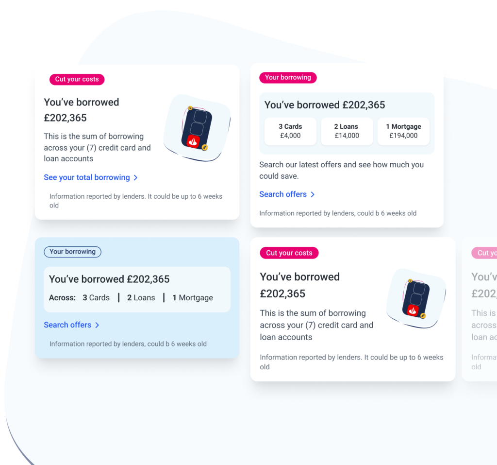
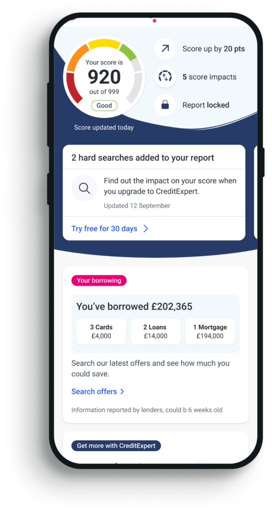
I designed wireframes for a personalised borrowing summary module, giving users a clear overview of their current credit usage — including cards, loans, and mortgages.
I explored multiple UI formats, such as carousels, dropdowns, and compact tiles. I also tested different onward journeys to understand what users found most valuable — whether being taken directly to their credit report for a detailed breakdown, or to a personalised offers page showing ways to save money. User testing clearly showed that the ability to save money was the most compelling outcome, reinforcing my initial hypothesis.
Outcome
The chosen solution is a clear, glanceable module that displays a user’s total borrowing across all credit accounts, along with the number of accounts they hold. Each section is interactive, linking directly to the relevant credit report (e.g. cards, loans, mortgages) where users can see detailed breakdowns including repayment history.
The primary CTA takes users to a personalised offers page, where they can explore credit deals that could help reduce their borrowing costs. This approach gives users both a clearer understanding of their financial situation and actionable ways to save money.
I’m now working closely with developers to further enhance the feature by pulling in additional data points — with the goal of making the experience even more personalised and valuable for users.