Experian
Website Redesign
One of my projects at Experian was the full redesign of the website, encompassing all marketing pages. Running alongside the broader brand refresh, this initiative aimed to unify Experian’s marketing touchpoints—including display, CRM, in-session experiences, and app users—creating a seamless and cohesive experience.
The redesign introduced refined brand colours, illustrations, and distinctive brand shapes to inform page layouts. A key focus of the project was ensuring consistency across all elements, which led to the creation of a comprehensive design system. This system, supported by detailed documentation, ensures that all components are used consistently and correctly across different platforms.

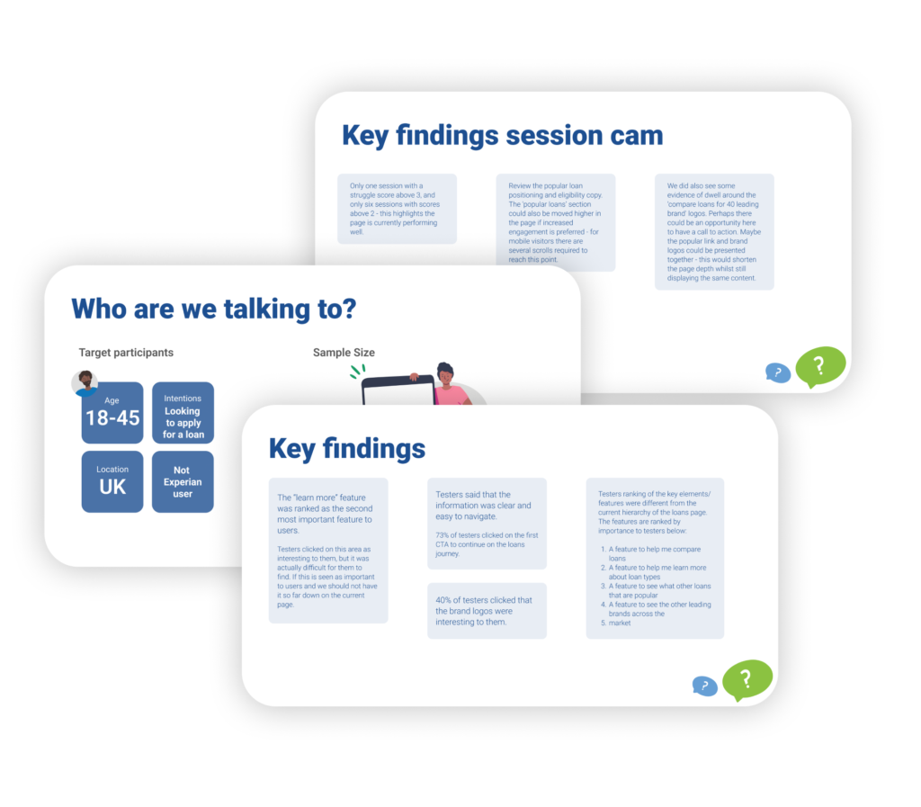
To kick off the project, I wanted to gain a solid understanding of how users currently perceive the website and experience the user journey. This initial phase involved working closely with the analytics team to identify pain points, scroll depth patterns, and key drop-off areas. Alongside this, I conducted in-depth user research, including surveys, click tests and think-aloud sessions with our core audience. These insights gave us a much clearer picture of where the existing designs were falling short and highlighted opportunities for meaningful improvement.
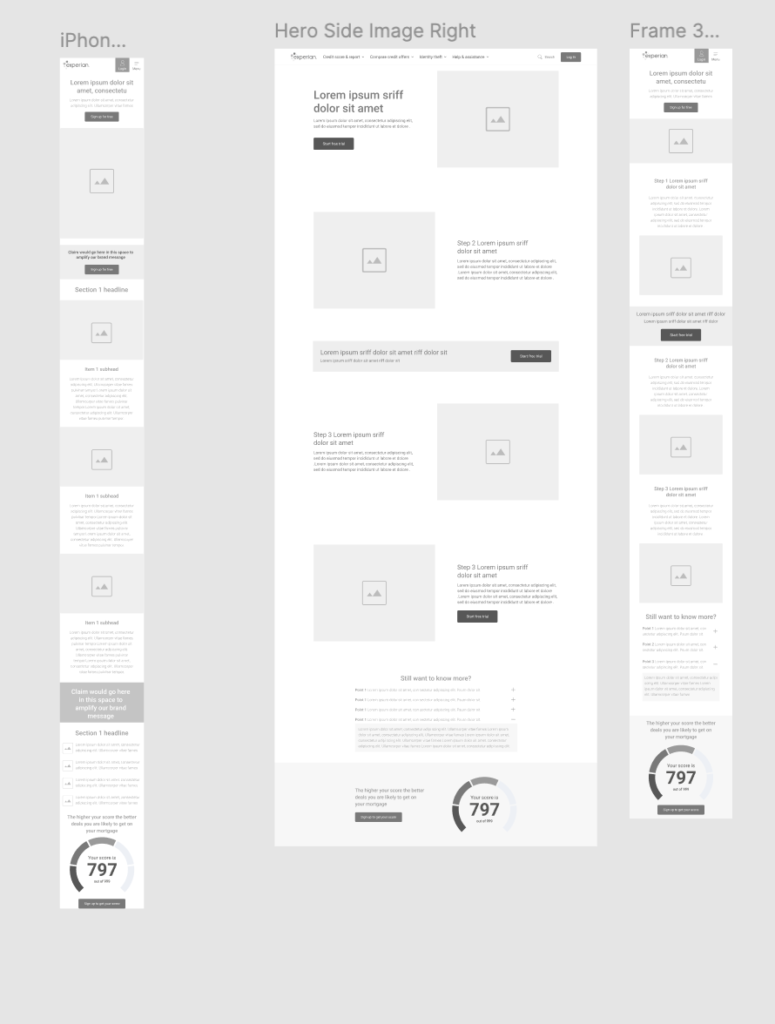
From there, I moved into wireframing. Since this was a complete website redesign, I wanted to follow an iterative process that allowed for regular user testing and feedback, rather than a single “big bang” release that risked missing the mark.
To achieve this, I started with a single page—the homepage. Using insights from our earlier user research, I focused on surfacing key information that users were previously missing or struggling to find. I wanted the homepage to tell a clear story of what Experian offers, making sure all areas of the business were represented and that the value to the customer was easy to understand.
The research had shown that many users found credit confusing and even stressful, so I aimed to ease that tension through thoughtful design. This meant providing clear, concise explanations of credit and credit scores, and presenting them in a calm, structured way that built user confidence from the moment they landed on the page.
From there, I took a few selected designs and turned them into rough prototypes to allow for further user testing. This helped validate the design decisions made so far and gave me useful insights to refine things even further.
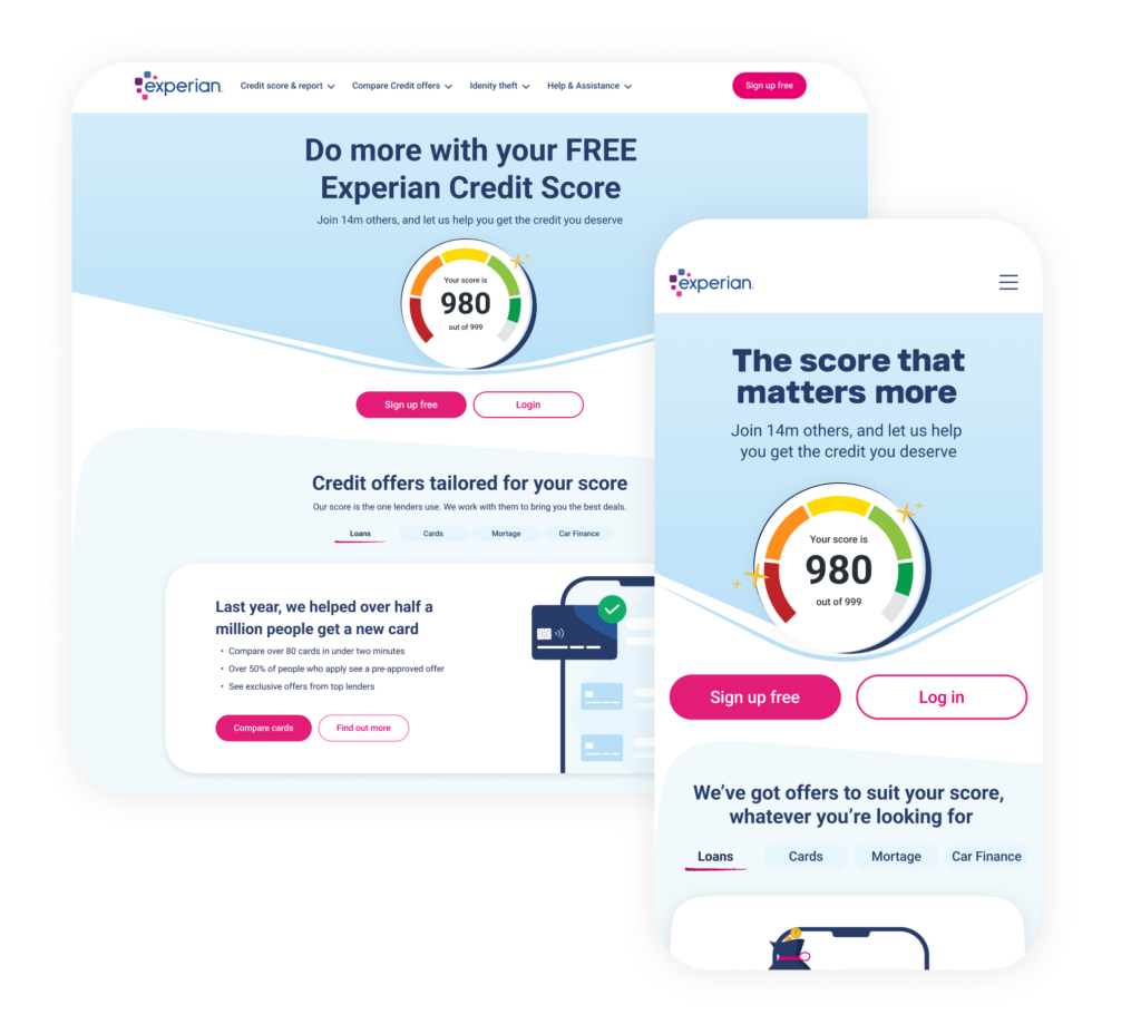
Once I was confident in the direction, I moved into the more polished design stage. This included applying the new brand colours and building out UI assets that had been developed as part of the rebrand. I wanted the final designs to be both visually strong and easy to use—but just as importantly, I aimed to document the design considerations clearly, so that the work could scale across other touchpoints, including CRM and marketing.
One example of this thinking was the introduction of the brand’s “squircle” shape into UI elements. I didn’t want this to be a purely decorative feature—it needed to serve a purpose. I used it strategically to guide the user’s attention to key elements, such as call-to-action buttons, helping create a more focused and intentional experience.
Accessibility was a core focus throughout the design process. From the very beginning, I wanted to make sure that every decision we made considered the needs of all users, especially those in more vulnerable situations. We worked with a range of user personas that helped us stay grounded in real-world needs — this was especially helpful in guiding empathetic, inclusive design thinking. I paid close attention to key accessibility details like ensuring strong color contrast, implementing clear tab order for keyboard navigation, writing meaningful alt text, and using simple, accessible language. Even small things, like choosing intuitive iconography, were carefully thought through to ensure nothing created a barrier to understanding or interaction.
Once I was confident in the initial designs — and everything was polished to a pixel-perfect standard — I began building them into reusable components. On the right, you can see how these components were set up in Figma. Each one supports multiple variants, which allows designers to easily drop them into their work without needing to make manual adjustments. This approach really helped establish a consistent, scalable design system that the wider team could rely on.
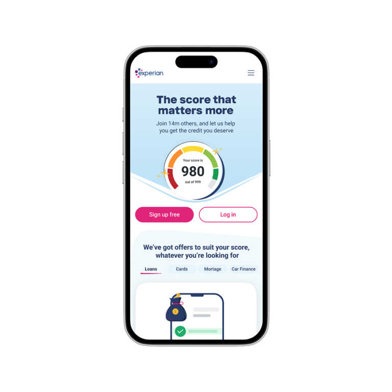
Once the designs were finalised, I worked closely with the development team to make sure the handover was smooth and the implementation stayed true to the design vision. We focused on creating a pixel-perfect result, but also worked together to introduce thoughtful micro-interactions that added a sense of refinement and helped guide users through key actions. At the same time, we were careful to ensure that these enhancements didn’t come at the expense of site speed or performance. We tested and optimised animations to make sure they felt light and purposeful without slowing the experience down.
The redesigned homepage is now live in an A/B test and is showing a 22% uplift in conversion, which is a really positive early indicator of its effectiveness.
Next, we’ll take the insights from this test to inform the rollout of updated components and patterns across the rest of the website. The goal is to apply what’s working, iterate on what can be improved, and continue feeding these learnings back into both the design system and development process to improve the overall experience across all touchpoints.
One of the intial prototypes can be seen here